


Business Cards, Design Inspiration
How to Choose the Right Font for Your Business Card
Aug
Choosing typography sounds simple until you see your details printed and realise half the text is hard to read. If you’ve already looked at common business card design mistakes to avoid, this is the next decision that usually makes or breaks the final result.
The right font does two jobs at once. It expresses personality and it stays clear at small sizes. That’s the balance.
Why font choice matters more than most people expect
A strong font can make your card feel premium, modern, traditional, or playful before anyone reads a single line. That immediate impression shapes how people remember your brand.
But visual style is only one part of the equation. A card is a practical tool. If someone cannot quickly scan your name, phone number, or role, the design has failed no matter how nice the typeface looks.
This is why we treat your type choice as a branding decision and a usability decision.
Start with brand personality, then narrow your typeface options
A useful way to choose is to start with tone:
- Professional and established: a classic serif font can work well
- Modern and clean: a sans style often reads faster in smaller text
- Personal and creative: a script style can work for accents, not full blocks
If your brand is corporate or legal, a serif option can add authority. If you’re a tech startup or consultant, cleaner lines often suit better. If you’re a florist or stylist, a script accent can add character, but keep core contact details simple.
You’ll also want one clear hierarchy:
- Business name
- Person name
- Role
- Contact details
Keep the strongest weight for the business name, then step down gently through the rest.
The practical rules that keep text easy to read
Print introduces constraints that screens hide. Use these checks before you approve artwork:
- Set key contact text at a readable size for print, not just monitor preview
- Avoid ultra-thin strokes for small type
- Keep contrast strong between text and background
- Leave enough spacing so lines do not blur together
- Limit decorative treatments in important details
Here is a useful baseline from production experience:
- Name and role should be easy to read in one glance
- Phone and email should never rely on light, condensed letterforms
- Small reversed text (light text on dark colour) needs extra caution
Tip: If you’re preparing artwork for business card printing Australia, choose clarity over novelty for contact lines and reserve expressive styling for headings or your logo.
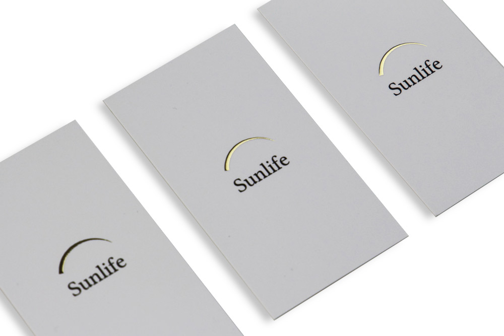
Font pairings that work for common Australian businesses
You do not need ten options. Two is usually enough.
- Tradies and local services: sturdy sans heading plus clean body text
- Professional services: refined serif heading plus neutral support text
- Creative brands: expressive heading style with a highly legible secondary option
- Luxury positioning: elegant serif headline with generous spacing
Popular families like helvetica still work because they reproduce cleanly and stay clear in tight spaces. The same applies to arial for utility and consistency.
For a premium look, pair a headline serif with a quiet support style. This gives personality without sacrificing function.
Common typography mistakes to avoid
These are the issues we see repeatedly in submitted files:
- Using three or four competing styles on one side
- Choosing an eye-catching heading style, then applying it to everything
- Reducing contact text too far to fit extra content
- Ignoring how a logo and text interact at final print size
The fix is usually simple. Reduce the number of styles, strengthen hierarchy, and remove non-essential words.
FAQ
What font is best for business cards?
There is no single winner for every industry. The best choice fits your brand tone and remains clear at print size. A clean sans or a well-balanced serif is often the safest place to start.
What is the 3 font rule?
It means limiting your design to a maximum of three styles. In practice, most cards perform best with one or two. More than that usually creates visual noise.
What is the most attractive business font?
Attractive is contextual. A font feels attractive when it matches your brand personality and still reads comfortably. Clarity plus fit beats trendiness.
Can I use custom fonts for my business card design?
Yes, as long as licensing is valid and readability is tested at final size. Always outline text or embed fonts correctly before sending files to print.
Final check before you print
When in doubt, print a test at actual size and read it at arm’s length. If anything feels strained, adjust spacing, weight, or style before ordering.
Once your typography is locked in, move on to the business card colour guide to choose a palette that reinforces your brand.