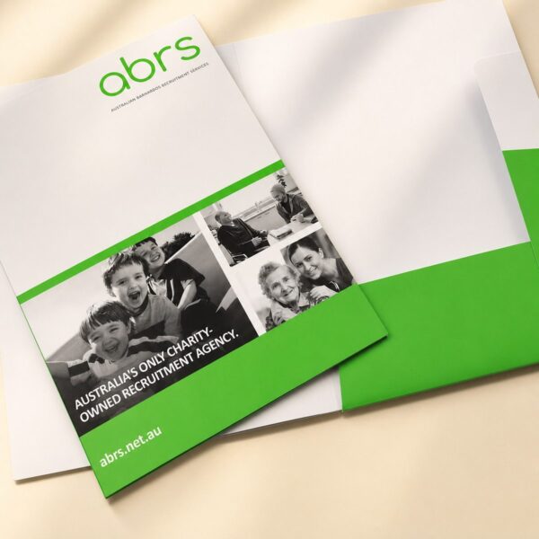
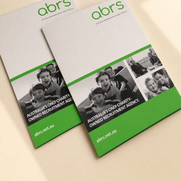


Business Cards
CMYK vs RGB: What’s the Difference for Business Card Printing?
Apr
If you are designing a card and wondering whether to choose RGB or CMYK, the short answer is simple. Use RGB for screens. Use CMYK for print.
Before you lock in your palette, choose the colours that suit your brand in the first place. Then, if you are getting ready to print your business cards, this guide will help you avoid common conversion surprises.
Most colour problems happen because people design in one color mode and expect the same result in another. The file looks perfect on your laptop, then looks flatter on paper. That is normal when the workflow is off. Once you understand how rgb and cmyk behave, the process gets much easier.
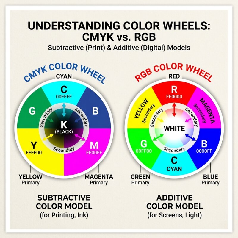
The quick difference between RGB and CMYK
Both systems describe colour, but they build colour in very different ways.
- RGB is an additive colour system used by digital screens.
- CMYK is a subtractive system used by ink on paper.
That one distinction explains almost every print mismatch people see.
In the rgb color model, your screen creates colour by combining light. In the cmyk color model, your printer creates colour by layering ink. Because ink and light behave differently, rgb colors and printed results are never perfectly identical.
What RGB means in real terms
RGB stands for red, green, and blue. Those are the three colors used to produce colors of light on a digital display.
When those three colors combine at full intensity, you see white. When there is no light, you see black. This is why rgb is called additive. You are adding light to build colour.
An rgb colour workflow is ideal for:
- websites
- social media graphics
- email banners
- digital ads
- on-screen presentations
You can often get very bright, saturated tones in RGB because screens can display a wider luminous range than print can reproduce with ink.
What CMYK means in real terms
CMYK stands for cyan, magenta, yellow, and key (black). It is the cmyk colour system used in commercial print.
CMYK starts with white paper, then subtracts reflected light by adding ink. That is why this is a subtractive process. The more ink you add, the less light reflects back to your eye.
A cmyk color setup is the right choice for:
- business cards
- flyers
- brochures
- packaging
- most offset and digital press jobs
If the final output is print, use cmyk early. That gives you a more realistic preview of what your final piece will look like.
Why colours shift between screen and print
This is the part that frustrates people most.
You might pick a bright electric blue in RGB, then notice it looks duller after conversion. That does not mean the printer made a mistake. It usually means your original rgb colour sat outside the cmyk gamut.
RGB has a larger visible range in some areas, especially intense neon-like shades. CMYK has a smaller printable range because it depends on physical ink limits.
So when you convert between rgb and cmyk, software maps out-of-range colours to the nearest printable equivalent. That nearest match can look less vibrant. The better mindset is not “make it identical.” The better goal is “make it consistent and predictable.”
CMYK or RGB: what should you use and when?
If the final product is physical, the answer is straightforward.
Use CMYK for print projects. Use RGB for digital work.
If you are still deciding cmyk or rgb for business card artwork, ask one question: will this be printed on paper? If yes, build or convert to CMYK before final export.
Here is a simple rule set:
- Digital-only asset: keep RGB.
- Print-only asset: use CMYK from the start.
- One design for both: design with print in mind first, then create a separate RGB version for digital use.
Trying to force one master file to do everything usually causes compromise in both directions.
How to check colour mode in common design tools
Photoshop
In Photoshop, check mode via Image > Mode.
- If you see RGB Color selected, you are in RGB.
- If you see CMYK Color selected, you are in CMYK.
To convert an rgb file in Photoshop:
- Open your document.
- Go to
Edit > Convert to ProfileorImage > Mode > CMYK Color. - Choose an appropriate CMYK profile for your print workflow.
- Review key colours before export.
Illustrator
In Illustrator, check File > Document Color Mode.
RGB Colormeans screen-oriented setup.CMYK Colormeans print-oriented setup.
To convert in Illustrator:
- Go to
File > Document Color Mode. - Select
CMYK Color. - Check linked graphics and swatches.
- Export print-ready PDF with CMYK output settings.
Using photoshop or illustrator correctly is less about memorising menus and more about deciding your destination early.
Practical file setup for business card printing
Once your desired color mode is set, keep your handoff clean.
- Keep text in vector format where possible.
- Embed or outline fonts if required.
- Export as print PDF with CMYK preserved.
- Check image assets are not still RGB.
- Confirm black text uses appropriate values for legibility.
If your artwork includes photos, gradients, or subtle brand tones, do a proof where possible. Seeing a physical sample is the fastest way to confirm your colours are tracking as expected before a larger run.
Common mistakes that cause costly reprints
1) Designing entirely in RGB, then converting at the end
Late conversion is the most common issue. You choose colour in a wide rgb space, then flatten into CMYK at export and lose punch in critical brand areas.
2) Ignoring profile warnings
When software flags out-of-gamut colours, do not ignore it. Those warnings are telling you the print result cannot match the screen exactly.
3) Assuming every printer interprets colour the same way
Different devices, stocks, and finishing options influence output. A matte uncoated card and a gloss-coated card can present colour differently, even from the same file.
4) Not separating digital and print outputs
Keep one version for screen and one for print. That gives you control rather than compromise.
How we recommend handling brand colours
At Space Print, we generally suggest this workflow for small businesses:
- Start with your brand reference values.
- Build your print artwork in CMYK.
- Review key colours on proof if accuracy matters.
- Create a separate RGB export for online use.
This approach avoids the trap of trying to make one file do two jobs.
If you have strict brand colour requirements, include your brand guide and any Pantone references with your order notes. That helps align expectations from day one.
FAQ
Is it better to use CMYK or RGB?
It depends on output. Use RGB for screens and CMYK for print. For business cards, use cmyk.
What happens if I print in RGB?
Most print workflows will convert the file automatically or during prepress. You may see muted or shifted tones compared with screen preview, especially in bright blues, greens, and neon-like colours.
Do I need to convert RGB to CMYK for printing?
Yes, in most cases you should convert before final export so you can review the result and adjust intentionally.
Why do we print in CMYK and not RGB?
Print relies on ink, not emitted light. CMYK matches how physical printing works, so it gives more realistic and controllable print output.
Final takeaway
RGB and CMYK are both useful. They just solve different problems.
RGB is best when people view your work on screens. CMYK is best when your design needs to exist in the real world on paper. Once you choose the right mode early, you reduce surprises, avoid reprint costs, and keep your brand looking consistent.
With your colour setup sorted, the next step is file geometry. Read our guide to business card bleed and safe zones explained before you export final artwork.