 HELP CENTRE



Guides
How to Recognise High-Quality Printing: Six 10-Second Tests
Sep
You run a print quality test most days without noticing. Every time you take a $50 note and rub your thumb across the portrait, you are checking intaglio, raised ink pressed into the note under enormous force from an engraved metal plate. The Reserve Bank lists that raised dark printing as an official security feature, because it is so hard to fake that your fingertip can tell the difference.
Commercial printing is judged the same way, just less consciously. People pick up a business card or a brochure and within seconds they have decided whether it feels like quality. The good news is that the signals they are reacting to are not mysterious. They are specific, physical, and checkable. This guide covers the quick tests anyone can run, and the standards professional printers hold themselves to behind the scenes.
Six 10-Second Tests Anyone Can Run
1. The touch test
Hold a business card flat by one edge. A quality card holds its line; a flimsy one droops. Flex it gently between your fingers: cheap stock takes a crease and stays bent, heavier board springs back. Weight is measured in GSM, grams per square metre. Around 350gsm is the professional standard for business cards, stiff enough to survive a wallet. Our range runs from 350gsm economy cards up to 450gsm velvet stock, and STAX cards at 700gsm, which are two boards bonded around a coloured core you can see on the cut edge.
The same logic applies to flyers. 150gsm is the most common flyer stock in Australia for a reason: below about 115gsm a flyer starts to feel disposable, and people treat it accordingly.
2. Zoom in on the small text
Open your phone camera and zoom right in on the finest type. On a well-printed piece the letter edges are sharp and a single clean colour. Coloured fringes or a faint double image around letters mean the printing plates were out of register. The international offset standard, ISO 12647-2, allows less than a tenth of a millimetre of drift between any two colours. That is the tolerance quality printers live inside.
There is a related professional habit you can check for: small black text should be printed in 100% black ink only, not built from all four colours. A four-colour black on small type fuzzes the moment registration drifts even slightly, which is why barcodes and body text are always run in pure black on properly prepared artwork.

3. Check the black
Find a large solid black area and compare it with black text beside it. If the big panel looks washed-out dark grey next to the crisp text, it was printed with black ink alone. Black process ink is actually slightly translucent: light passes through the ink film, bounces off the white paper underneath, and comes back out, lifting the black towards grey. Quality printers lay cyan, magenta and yellow underneath large blacks, a build called rich black, so the panel absorbs light properly and reads dense and deep.
4. Run your eye along the edges
Look at all four edges of a card, and at the border widths if the design has one. A hairline sliver of white along one edge, or borders of visibly different thickness, means the cut drifted. Guillotines cut tall stacks of paper, and paper compresses and shifts under the clamp, so the Australian trade standard is 3mm of bleed, artwork extended past the trim line on every side. When a printer skips that allowance, or the cutting is rushed, the edges tell on them. Clean, even edges on every side mean the whole chain, artwork, press and finishing, was done properly.
5. Open the fold
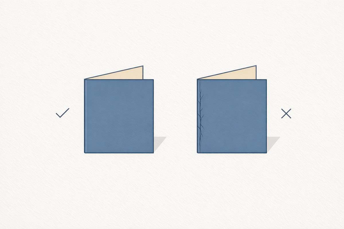
On any folded piece, look at the outside of the spine. White cracked lines along the fold mean heavy stock was folded without being creased first. Folding thick board without a crease tears the paper fibres, and any coating on top fractures with them. The trade rule is that stock from about 170gsm up should be creased before folding, and there is a second rule most people never hear: press varnish, aqueous coating and UV coating do not prevent fold cracking. Only film lamination does. A laminated brochure cover that folds cleanly is a sign someone specified the job correctly.
6. Study a photo or gradient
Zoom in on a sky, a skin tone, or a colour fade. Visible stepped bands where the colour should flow smoothly, or a checkered moiré pattern in fine textures, are screening problems. Commercial quality offset runs a 175 lines-per-inch screen on coated stock, and the very top end of reproduction, fine art books and premium packaging, uses stochastic screening with dots around 20 microns, holding roughly the detail of a 300lpi screen. You do not need the numbers, though. Smooth is the tell.
Weight Is Not the Whole Story
Two stocks at the same GSM can feel completely different, because GSM measures weight, not thickness. Thickness is a separate measurement called caliper. A 350gsm uncoated recycled board measures around 395 microns thick, while a 350gsm coated silk measures around 347 microns. Same weight on the scales, a clearly different card in the hand, because coating adds weight without adding bulk.

That is why “how many GSM?” is a good first question but a bad only question. What the board is, how it is coated, and what is laminated onto it matter just as much. Our four presentation folder options, for instance, are all 350gsm board; the difference you feel is the laminate.
The Surface Decides the Colour
Paper people have a saying: the sheet is the hidden fifth colour. A coated paper holds ink up at the surface, so the dots stay small and the pigment stays dense, which is why coated stock gives you sharper detail and more saturated colour. An uncoated sheet drinks the ink into its fibres, physically enlarging every dot. The calibration standards even quantify it: uncoated paper is expected to gain roughly six points more in the midtones than coated. Uncoated prints softer and quieter, which can be exactly the right look, but it is physics, not a printing fault.
Laminates change the story again. Gloss laminate maximises colour pop. Matt laminate is more elegant but naturally more prone to scuffing, its microscopically rough surface concentrates wear on the high points, which is why anti-scuff matt laminates exist and why quality printers use them. Velvet (soft-touch) laminate adds the distinctive suede feel. That feel does real work: peer-reviewed research in the Journal of Marketing found that pleasant touch measurably increases how persuasive a marketing piece is.
Colour Is a Number, Not a Feeling
Professional colour is standardised. ISO 12647-2 defines exactly what each process colour should measure and how far a printed sheet may deviate, within a Delta-E of 5, a unit of colour difference where 1 is roughly the smallest difference a trained eye can see. It even requires that at least 68% of the sheets in a run stay within tolerance of the approved sheet. When a printer talks about running to ISO or Fogra standards, this is what they mean: colour verified with instruments, not eyeballed.
For you as a customer, the practical version is simpler. Screens emit light and print reflects it, so what you see on screen will always differ from the finished piece, and a brand colour specified as a Pantone number can only be approximated in four-colour CMYK printing. A printer who converts your file properly, sends you a proof before production, and tells you honestly what will shift is showing you their quality process. That is exactly why we proof every job before it goes to press, and your first two proofs are free.
Finishing Is Where Corners Get Cut
Some of the strongest quality signals are invisible until someone skips them. Freshly printed sheets need a minimum of 24 hours to dry before laminating or coating, and rushing that step causes an ugly family of defects: film that ripples, varnish that crawls into an orange-peel texture, ink that transfers between stacked sheets. Foil has to go down before some coatings and cannot bond to others. Embossing has to come last or the press flattens it. Spot UV needs clearance from trimmed edges or it chips.
None of this appears on a quote. All of it appears in the finished job. It is why two “identical” specs from two printers can land so differently, and why the cheapest quote sometimes costs the most.
The Obsessives: What the Best in the World Do
When quality really matters, printing becomes almost absurdly exacting.
Note Printing Australia, 25km north of Melbourne, prints every Australian banknote. Australia invented the polymer banknote, the world’s first was the 1988 bicentennial $10, developed over two decades by the Reserve Bank and CSIRO, and the raised intaglio printing on every note is a security feature precisely because commercial processes cannot match its sharpness. The result: Australian counterfeiting rates are measured in the tens of notes per million.
Apple maintained a badge-access packaging room at its headquarters where, according to journalist Adam Lashinsky’s book Inside Apple, a designer spent months testing arrow, colour and tape variations for the little pull-tab that opens an iPod box. The inexpensive box, Lashinsky wrote, merits as much attention as the electronics inside.
Gerhard Steidl, the Göttingen printer profiled by The New Yorker in 2017 as arguably the best in the world, lives next door to his press, selects the paper for every book personally, and inspects sheets as they come off the machine. The world’s leading photographers queue for years to have him print their work.
You are probably not ordering banknotes. But the lesson transfers: quality printing is not a look, it is a set of tolerances, checked at every step by someone who cares.
What This Means When You Order
You do not need to memorise standards to buy well. Ask three things. What stock and weight, exactly, and what laminate? Will I see a proof before production? And does the artwork have proper bleed and safe margins? A printer with confident, specific answers to those three questions is a printer who sweats the details you now know how to check.
At Space Print, every job is proofed before it prints, files are professionally preflighted and converted for press, business cards start at 350gsm and run to 450gsm velvet and 700gsm STAX, and delivery is included Australia-wide on print products. And when your cards arrive, run the six tests on them. We are happy to be checked.
Frequently Asked Questions
Is heavier stock always better?
No. Weight should match the job: 350gsm feels right for most business cards, but a 700gsm STAX card in a design meant for quiet minimalism, or a heavy glossy sheet where a soft uncoated suits the brand, is the wrong choice well made. Quality is the stock suiting the purpose, and the printing on it being clean.
Why does my print look different from my screen?
Screens emit light in RGB; print reflects light in CMYK. The two can come close but never match exactly, and some vivid screen colours are physically impossible in ink. A proof is the honest preview: it shows you what the press will actually do before you commit.
What is the single fastest quality check?
Phone camera, maximum zoom, smallest text. Sharp single-colour edges mean the registration, artwork and press work were all done properly. Fringing and double images mean they were not. It takes ten seconds and it is very hard to fake.
Do these tests work on flyers and brochures too?
Yes, all six. Flyers show weight and gradient problems most clearly; folded brochures add the fold test, which is the most common place cheap print fails. If a brochure cover has cracked white lines down the spine, the printer skipped creasing, and you are allowed to judge them for it.